<Cards/>
Component renders a card that may take in a chart followed by some descriptions and optionally links.
Props
imgURI <String>
The imgURI to pass for the Card.
width <String> || <Number>
The width you want to set the card too.
height <String> || <Number>
The height you want to set the card too.
imgWidth <String> || <Number>
The width you want the imgWidth too.
imgHeight <String> || <Number>
The height you want the imgHeight too.
header <String>
The header(title) for the Cards
detail <String>
The detail you want to give the Cards.
links <Array>
An array of objects that has to have the shape of
{
  link: <String>
  title: <String>
}
linkColor <String>
The color you want the link to be.
graph <React Element>
Optional parameter to place one of the graphs (Line, Area, etc.) in place of an img.
Examples
<Cards graph={
<RadarChart width={350}
height={300}
data={data5}
rangeKey='y'
labelKey='skill'>
<RadarArea dataKey='k1' color='blue' colorOpacity='.7'/>
</RadarChart>
}
width='100%'
height={450}
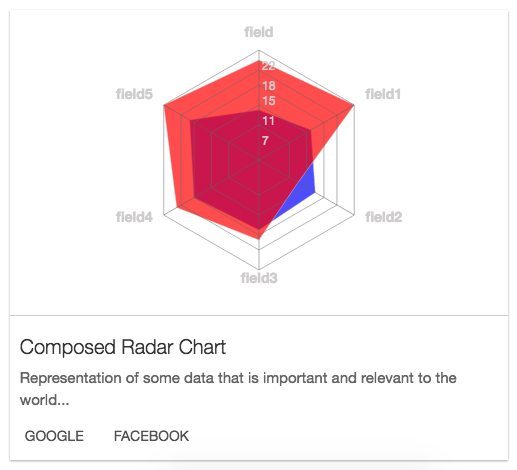
header="Lonely Radar Chart"
detail="Representation of some data that is important and relevant to the world 2..."
links={[
{
href: 'http://google.com',
title: 'google'
},
{
href: 'http://facebook.com',
title: 'facebook'
}
]}>
</Cards>
Sample Card